


Deer Oaks Behavioral Health Rebranding
OVERVIEW
Deer Oaks is a leading full-service behavioral health organization. Since 1992, the clinician-owned and operated company has provided psychological services and psychiatric medication management to residents in long-term care and assisted living and rehabilitation facilities across the United States.
Deer Oaks’ team of psychologists, psychiatrists, clinical social workers, and nurse practitioners provide care in more than 1,500 partnering facilities.
CHALLENGE
For years, Deer Oaks had focused their time and resources on serving their patients and partnering post-acute care facilities. When the new Chief Growth Officer saw the need to invest in distinctive branding materials to attract new clients, create strong patient engagement, and develop strategic partnerships, he brought in Lightspeed.
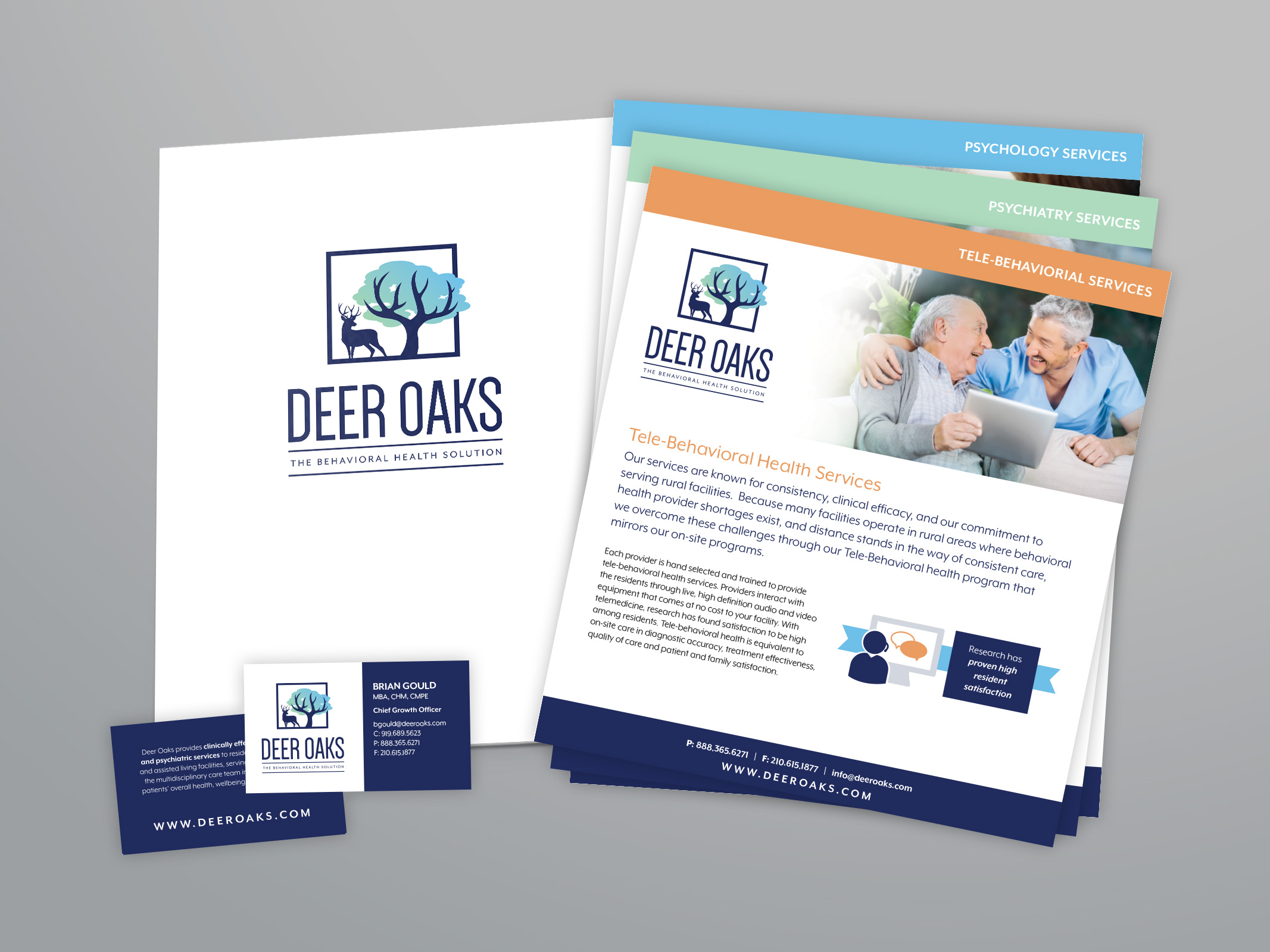
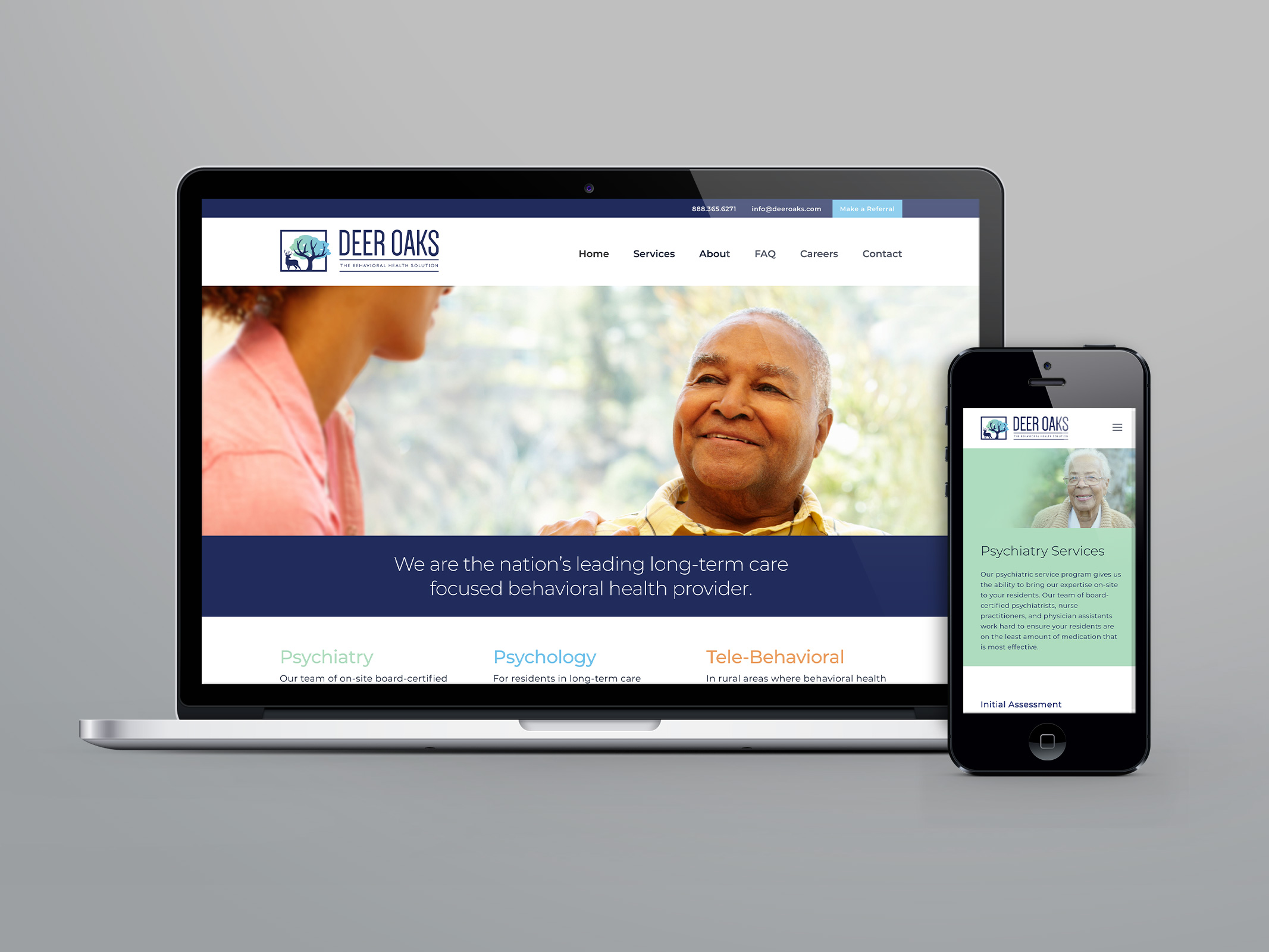
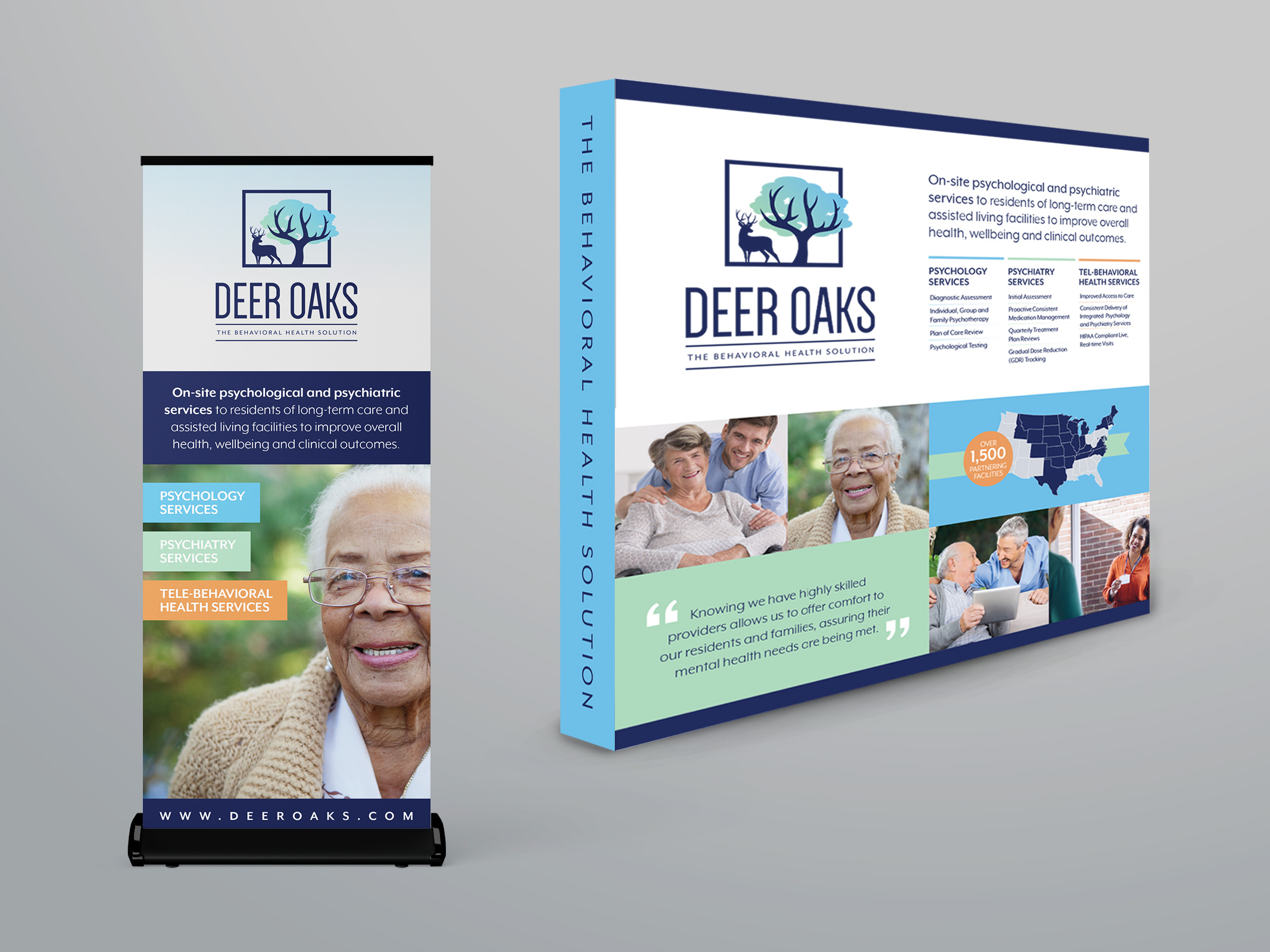
Deer Oaks needed a full portfolio of marketing collateral pieces, starting with replacing their old business cards and a text-heavy brochure. Their outdated website wasn’t helping win new business or recruit new clinical team members. Plus the company lacked control over how their 1,500+ partnering facilities used the Deer Oaks logo in their respective marketing efforts.
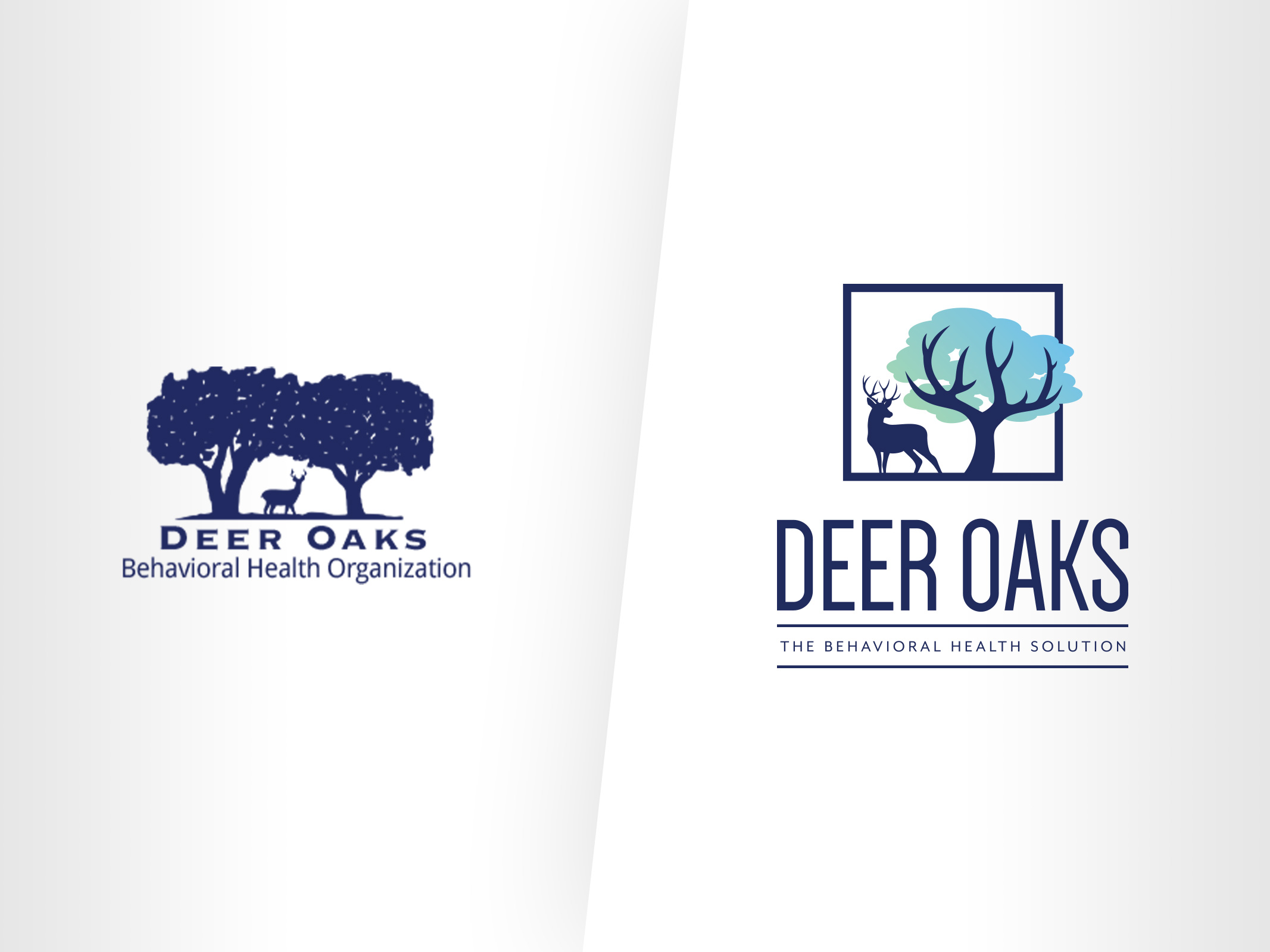
Perhaps most challenging of all was the nearly 30-year-old logo itself, a literal interpretation of the company’s name. The company was invested in keeping some type of deer and oak imagery, so re-imagining the logo meant sticking close to the original concept but with a new, modern vibe.
SOLUTION
Lightspeed created a full rebranding solution to reflect a industry leading company and attract new business:
- New logo with re-conceptualized imagery that remained true to the company’s history
- Guidelines for how the company’s many partners can use the logo in their own marketing efforts, giving Deer Oaks better control over their visual brand
- Newly launched website focusing on the company’s three core services
- Digital elements including consistent email signatures
- Signage and handouts for trade shows, including sales sheets and brochures
- New business cards and letterhead
Lightspeed designed the new collateral pieces to be adaptable so the company can easily update and print them locally as needed.
A new color palette, modern fonts, and other graphic elements provide a fresh, consistent look to all Deer Oaks marketing materials, while building on the years of trust the company has established in their brand.
“
I was extremely impressed with Lightspeed throughout the process from initial brainstorming to finished products. They not only listened to our vision, but found a way to articulate that into an impressive finished product beyond what we had the capacity to do internally. They have helped us rebrand our organization to showcase us as the industry leading clinical provider that we are today. This project will help us with patient engagement, business development, client retention, and recruiting clinical providers. Their team was engaged and most importantly met the deadlines that were provided from the start of the project. After working with other companies, I would strongly recommend Lightspeed.”
– Chief Growth Officer, Deer Oaks

2019 Gold MarCom
Strategic Communications – Marketing/Promotion Campaign –Branding Refresh